

From Viewer to Participant
UX/UI Design | Entertainment | Independent Product Concept
This project started with a frustration.
As an active Love Island viewer, I found myself using the app every day, yet the experience consistently felt harder than it needed to be. Voting lacked urgency, Islanders were difficult to explore, and key interactions were buried beneath competing content.
Rather than complain about it, I opened Figma and redesigned the experience.
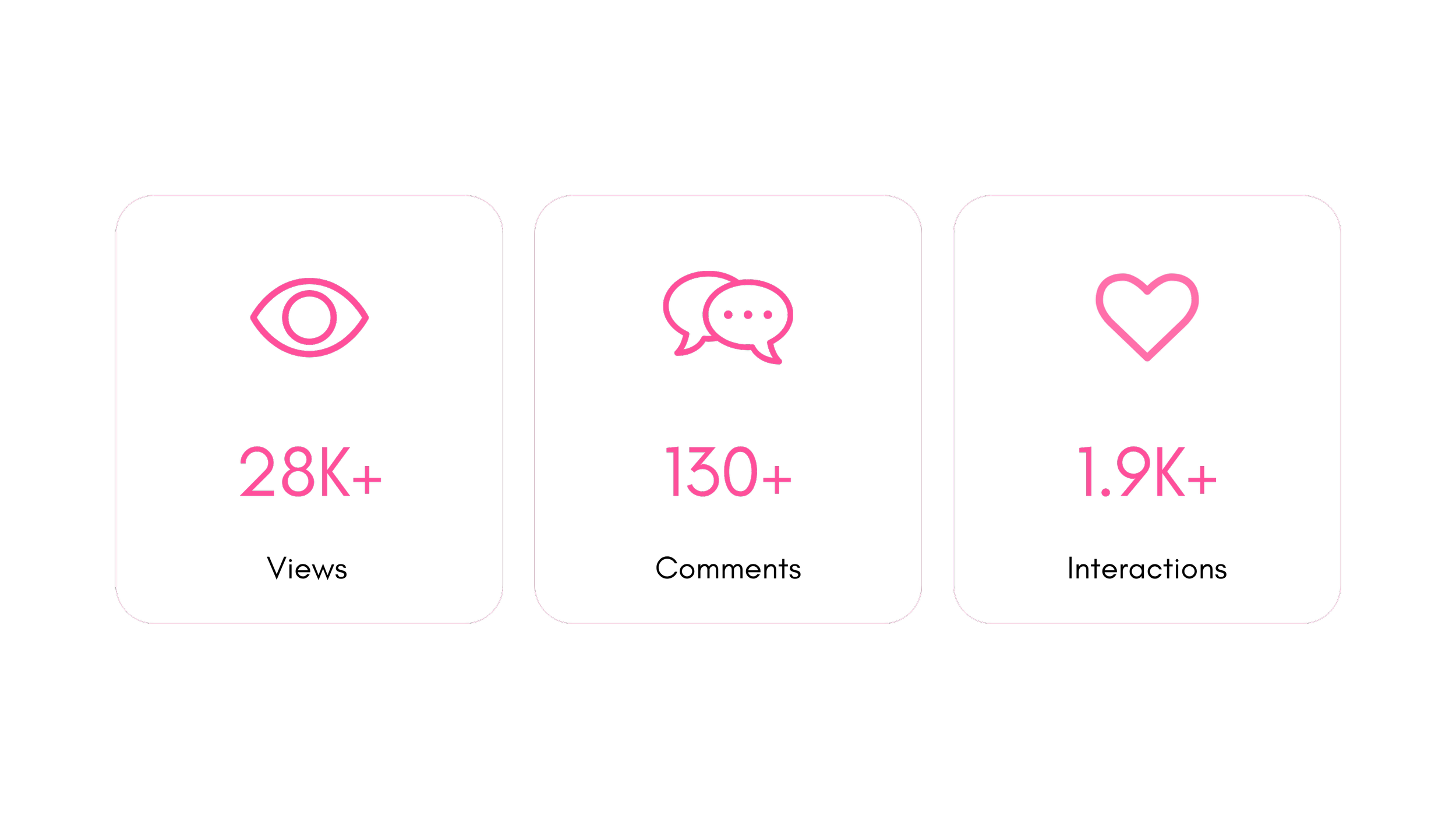
The result sparked a public conversation among fans, designers, engineers, and product leaders, generating over 23,000 views and 1,500 interactions within hours of publishing.
My role: UX research, product strategy, information architecture, interaction design, UI design, prototyping, and public validation.

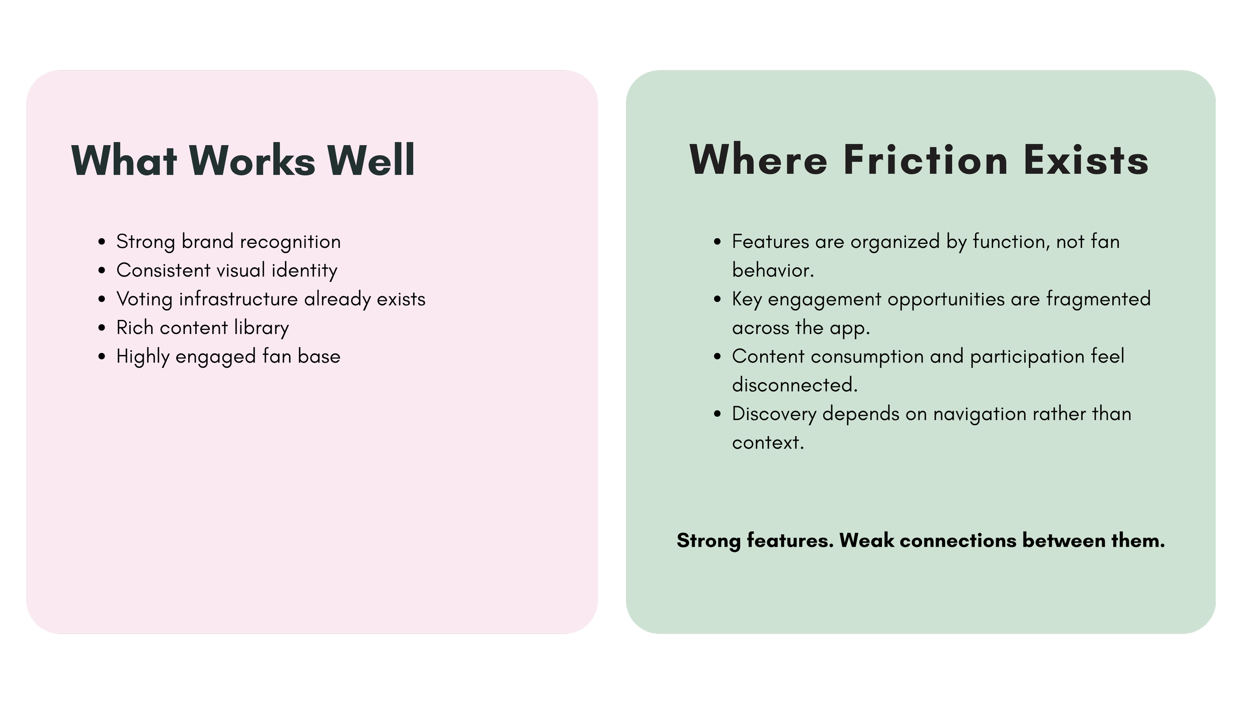
THE PROBLEM
The app serves a highly engaged audience, but the experience often prioritizes content delivery over fan participation.
Voting is the show's most important interaction, yet it competes with promotional content. Islander profiles provide limited storytelling value, and navigation makes it difficult for fans to follow the people and relationships that drive the show's popularity.
Every additional tap creates friction between fans and the actions they care about most.
RESEARCH + OBSERVATION
As a daily user of the platform, I conducted a heuristic review of the current experience and analyzed the primary fan activities supported by the app.
Three recurring goals emerged:
① Vote for Islanders
② Follow relationships and storylines
③ Explore contestants beyond episodes
These behaviors became the foundation for the redesign.
Every interaction should create another opportunity for engagement.
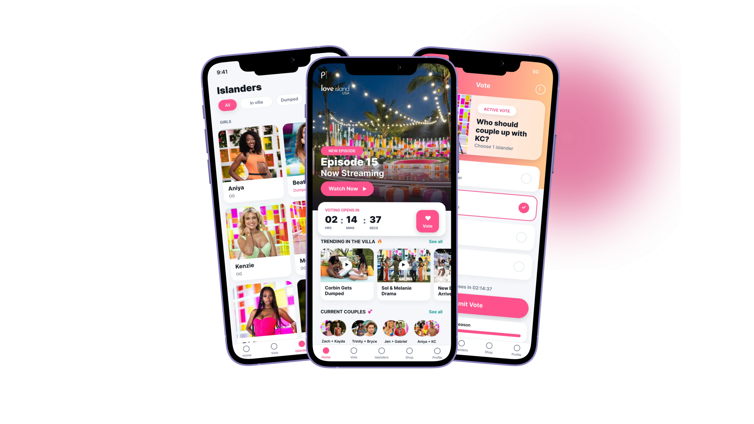
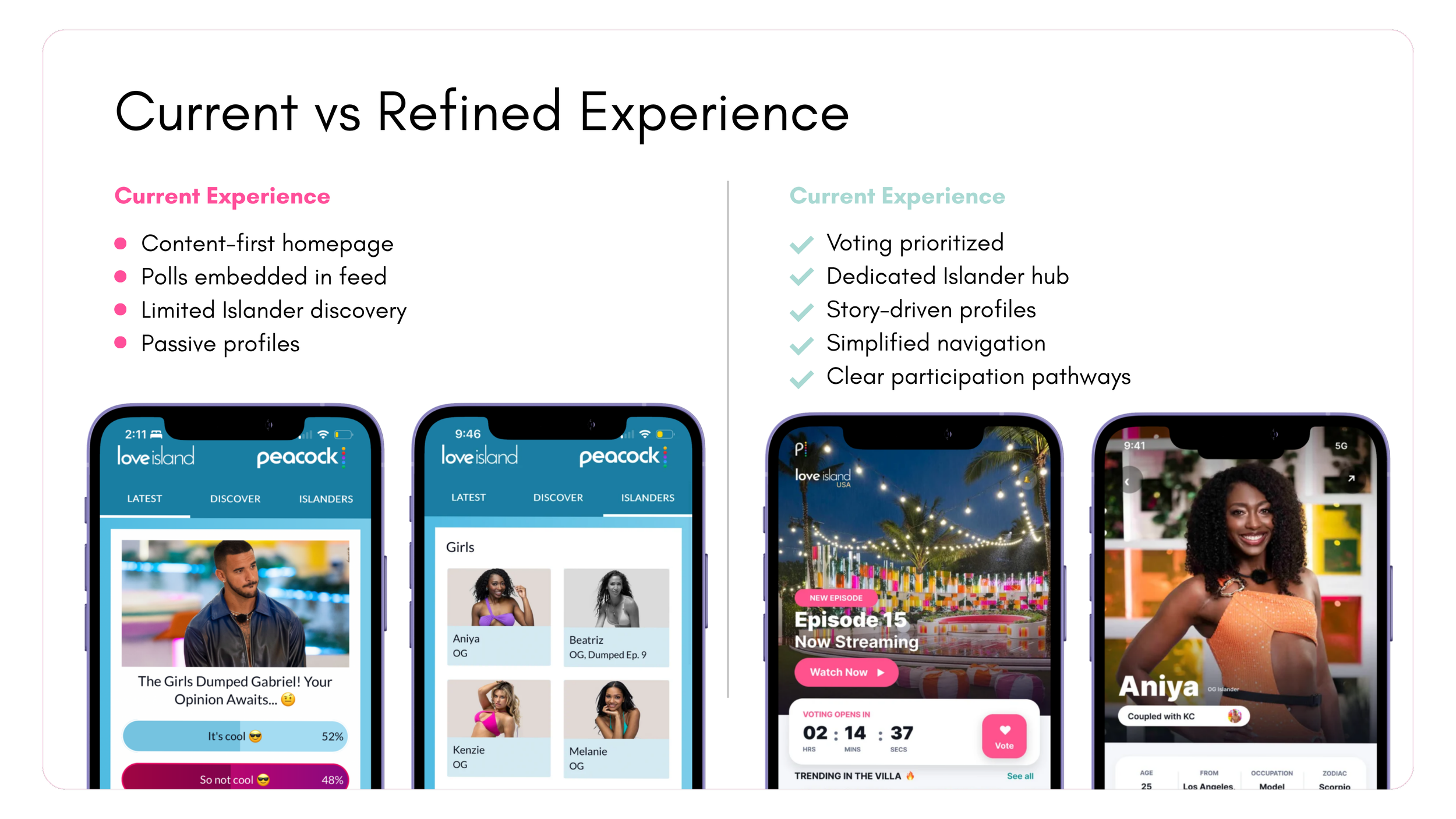
Solution Highlights
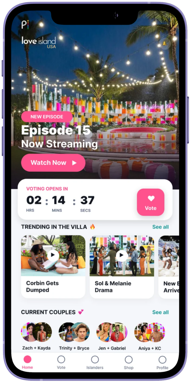
Voting as the Primary Action
Voting is the show's most important fan interaction.
The redesign introduces stronger hierarchy, visible countdowns, and simplified flows that create urgency and encourage participation.
Building an Islanders Hub
Contestants are the center of the Love Island experience.
Filters, imagery, and clear status indicators make it easier to discover Islanders and follow their journeys.

Turning Profiles Into Stories
Rather than functioning as static bios, profiles become narrative experiences.
Journey timelines, relationship updates, and key moments help fans quickly understand each Islander's story.

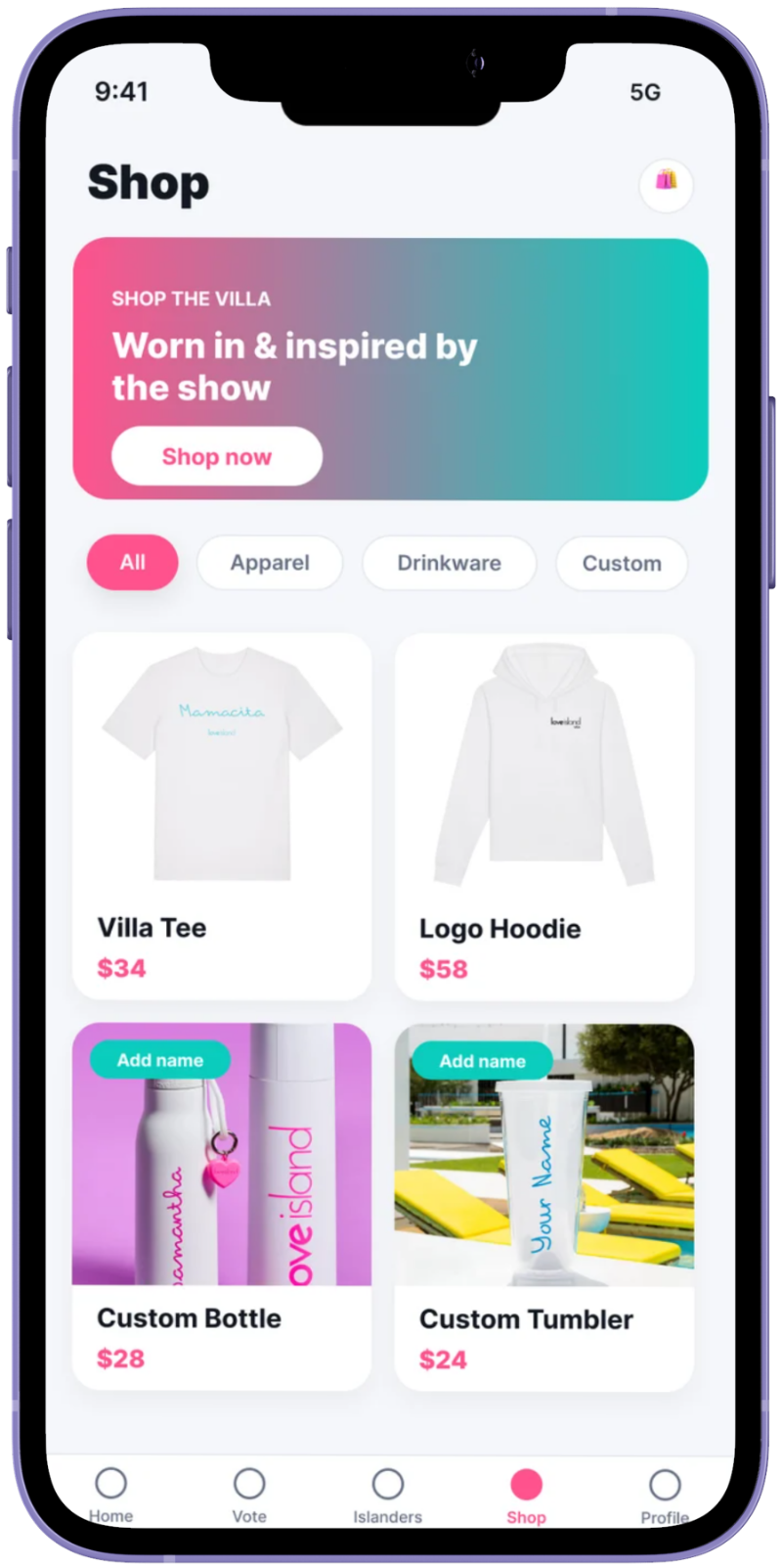
Extending the Brand Through Commerce
The existing merchandise experience is disconnected from fan activity.
The redesign integrates shopping more naturally into the broader ecosystem, creating clearer pathways between fandom and purchase behavior.
PUBLIC VALIDATION
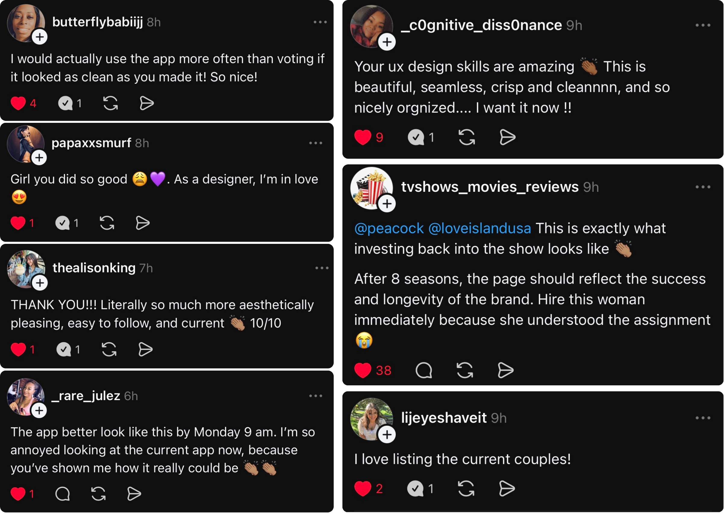
After sharing the redesign publicly, the project generated significant engagement from fans, designers, and product professionals.
Many commenters echoed frustrations identified during the review process and expressed enthusiasm for a more fan-centered experience.

STRATEGY
KEY TAKEAWAY
The strongest design decisions weren't visual.
They came from understanding why fans open the app in the first place.
The redesign wasn't about adding new features. It was about creating stronger connections between existing ones and reducing the distance between content consumption and participation.
This project reinforced an idea I return to often:
Good design helps people complete tasks. Great design builds momentum.
