

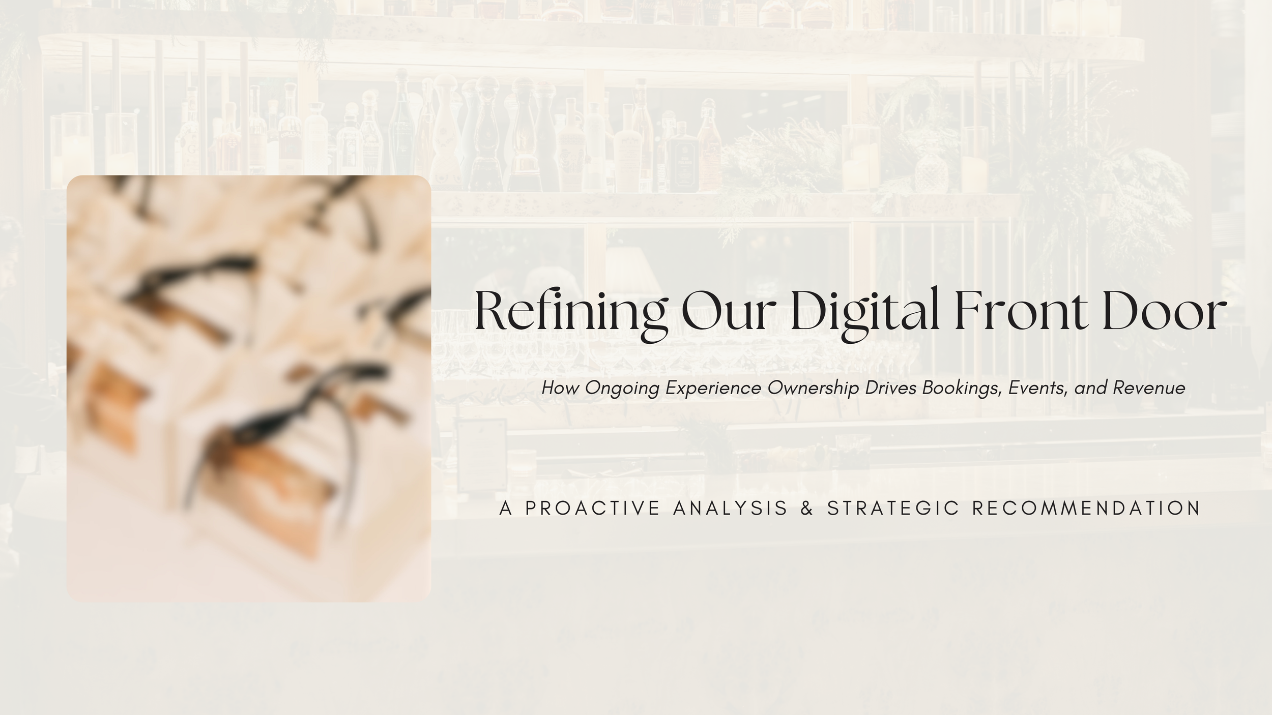
Refining the Digital Front Door
UX Research & Strategy | Hospitality | Proactive Project
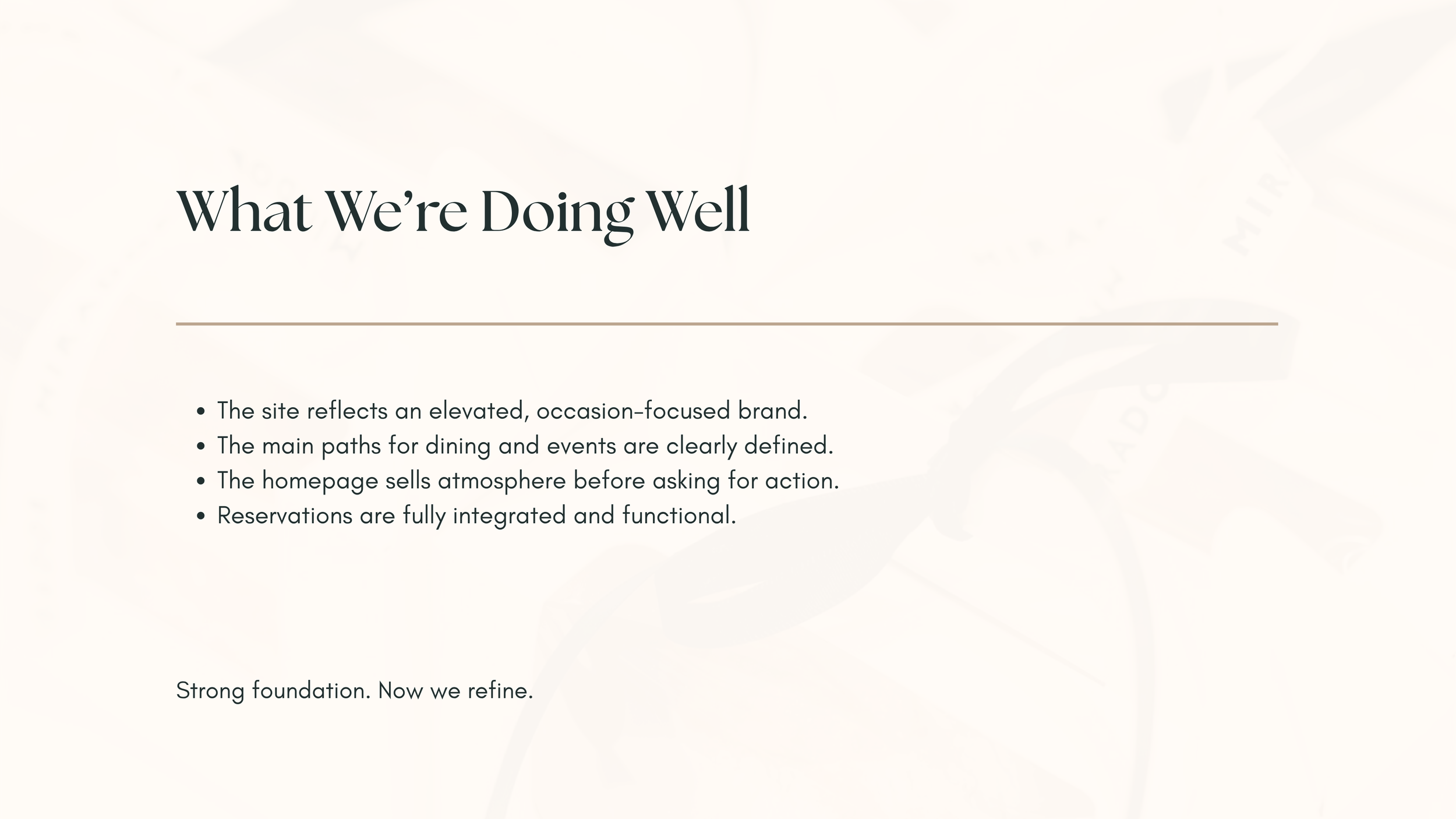
This one started with a hunch. I was working closely with a fine dining restaurant group and noticed their website wasn't doing the job their in-person experience deserved. The brand looked right. The booking experience didn't.
Nobody asked me to fix it. I just built the audit, ran the research, and brought the recommendation to leadership anyway. That's the kind of designer I am.
My role: research, usability testing, flow analysis, redesign, revenue modeling, and presentation.

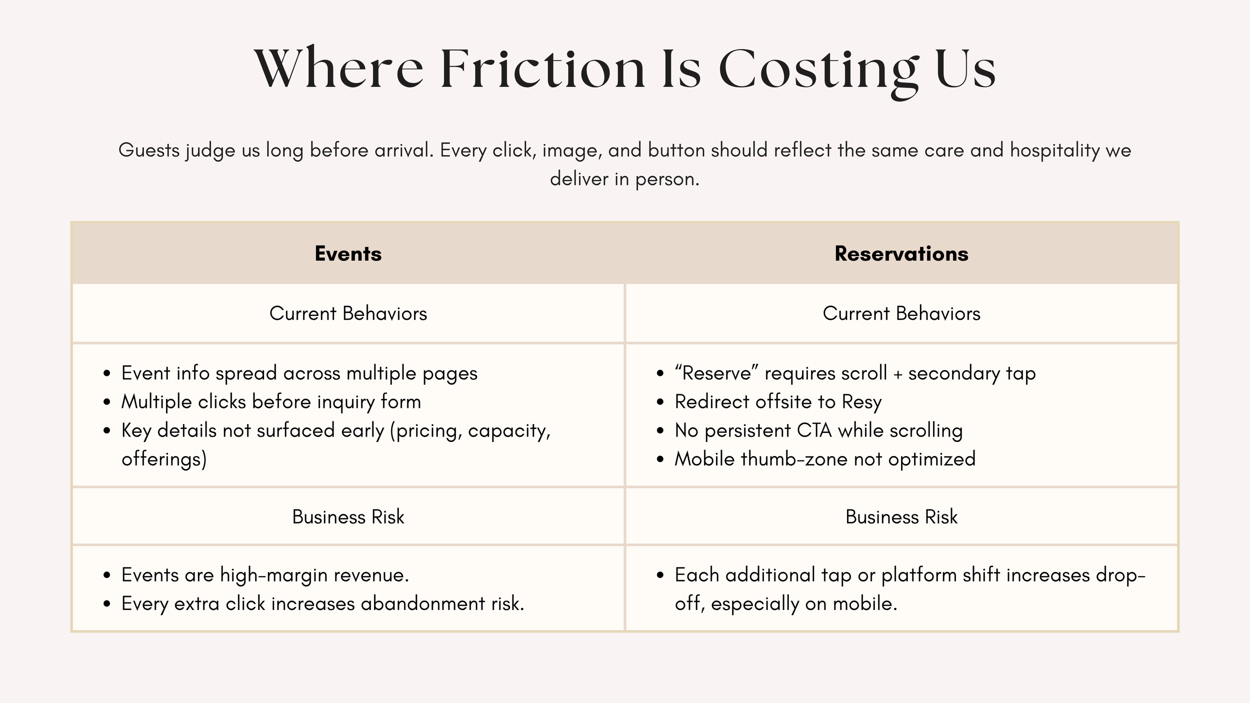
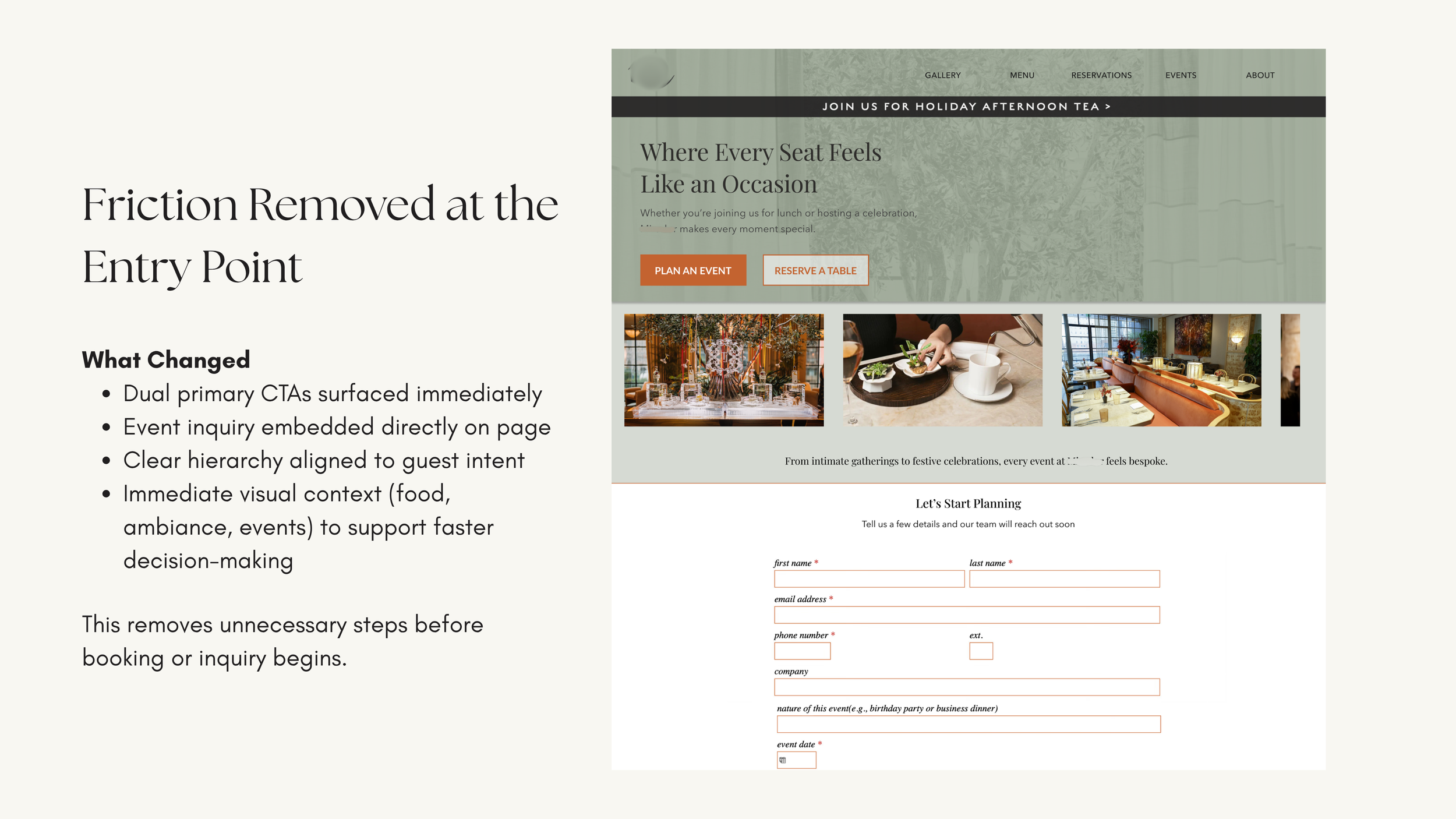
THE PROBLEM
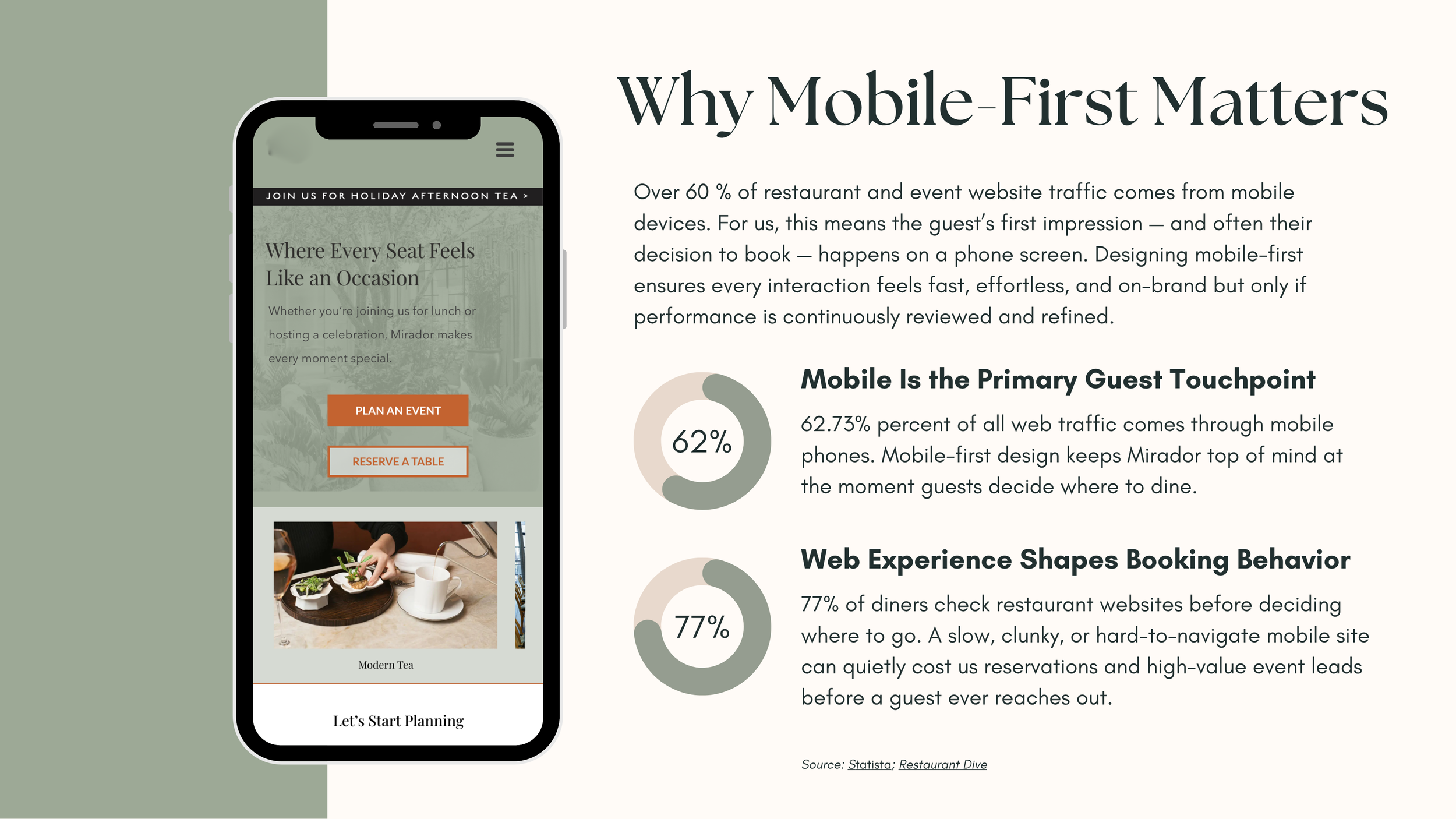
The site had a strong visual foundation but friction was quietly costing reservations and event leads. Event information was scattered across multiple pages with no clear inquiry path. The reservation CTA required scrolling, a secondary tap, and a redirect offsite. On mobile, where over 60% of restaurant traffic originates, every extra step is an exit opportunity.
Events are high-margin revenue. Every unnecessary click is an abandonment risk.
RESEARCH + TESTING
I recruited 6 participants and ran task-based usability testing on two primary flows: completing a reservation and submitting an event inquiry.
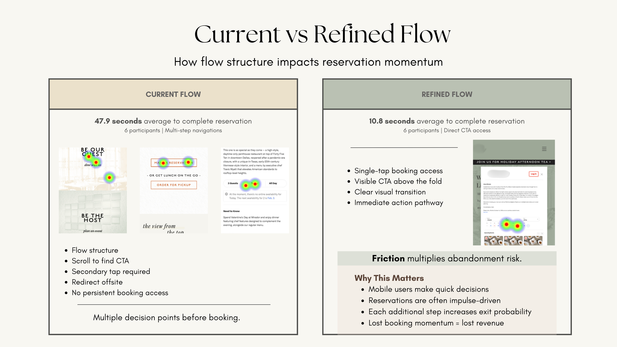
47.9s
current flow avg.10.8s
refined flow avg.6
participants testedTHE RECOMMENDATION
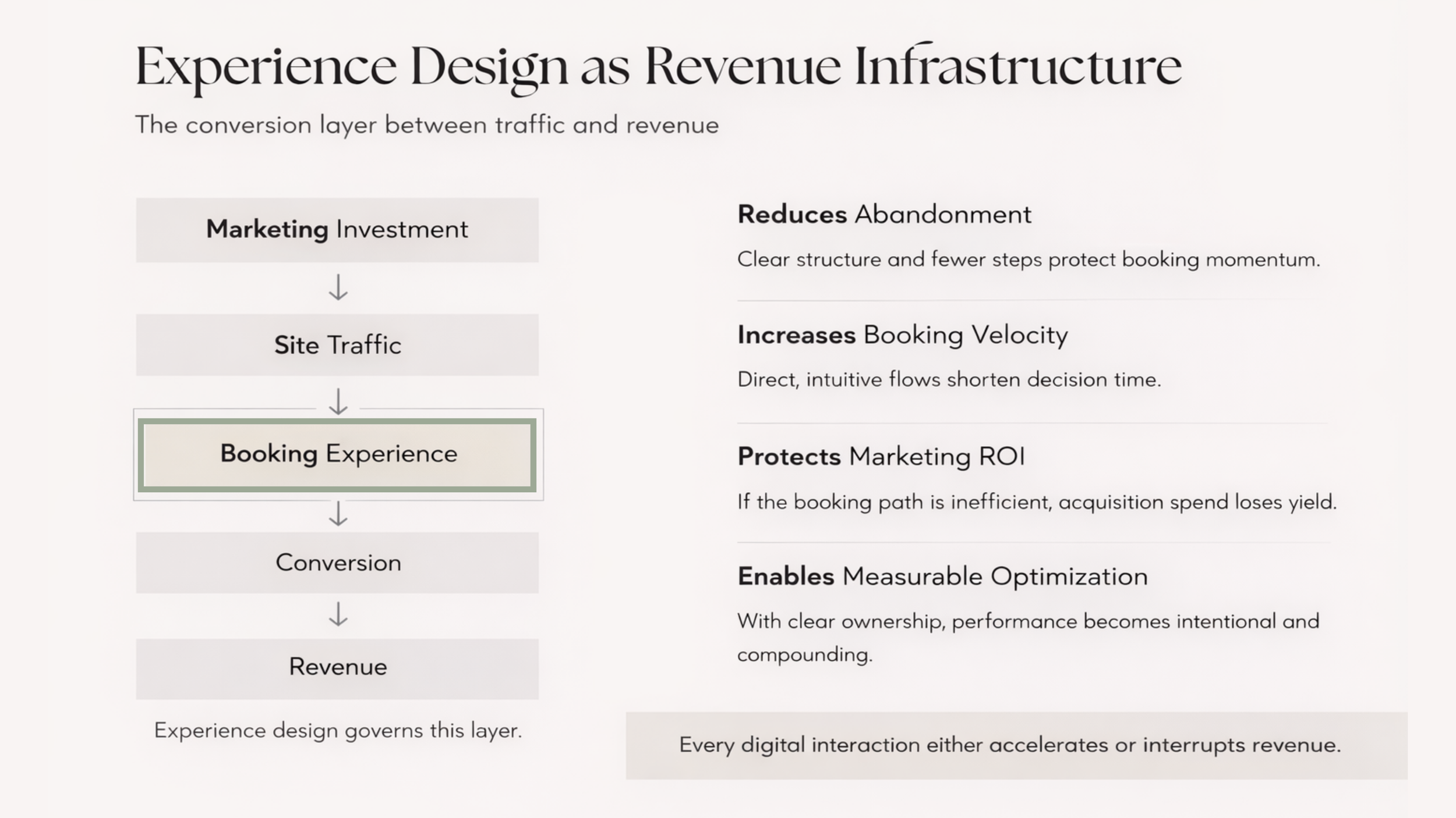
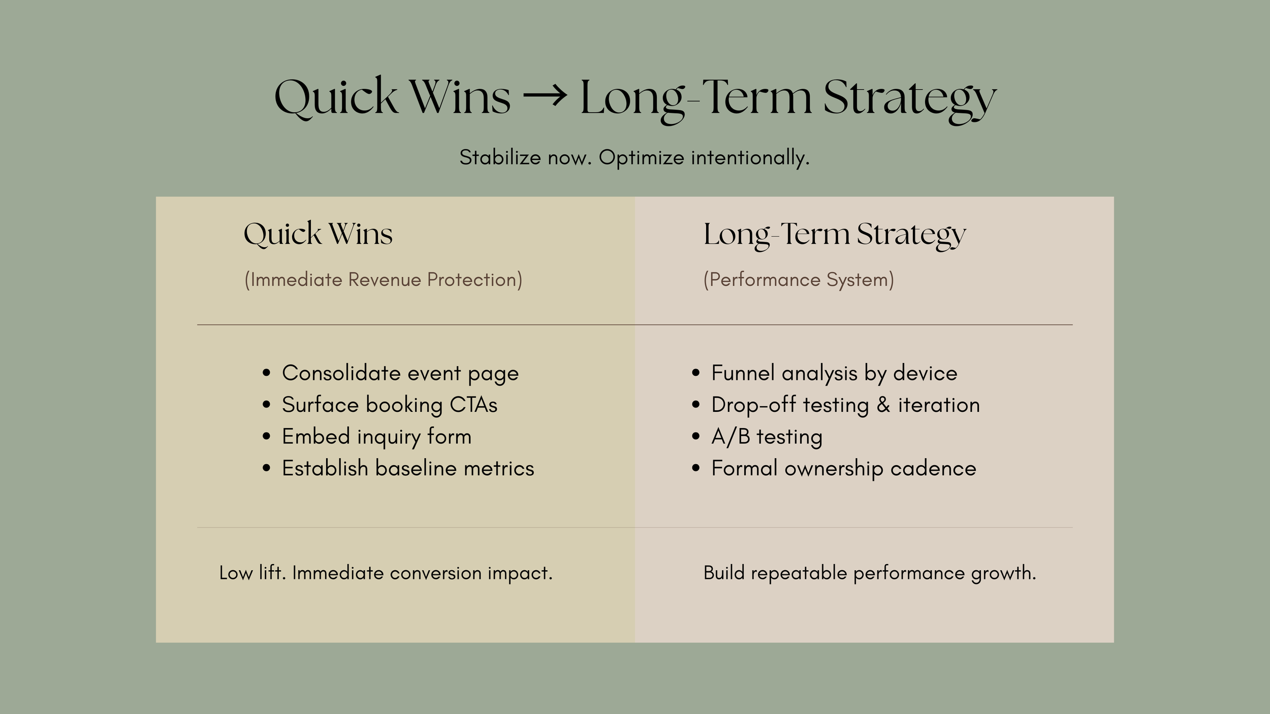
I redesigned the homepage experience with dual primary CTAs surfaced above the fold, an embedded event inquiry form, and a mobile-first layout built around where thumbs actually land. The strategic framing was simple: experience design isn't a visual exercise, it's the conversion layer between marketing spend and actual revenue. If that layer has friction, every dollar driving traffic loses yield.
MOBILE + MEASURING
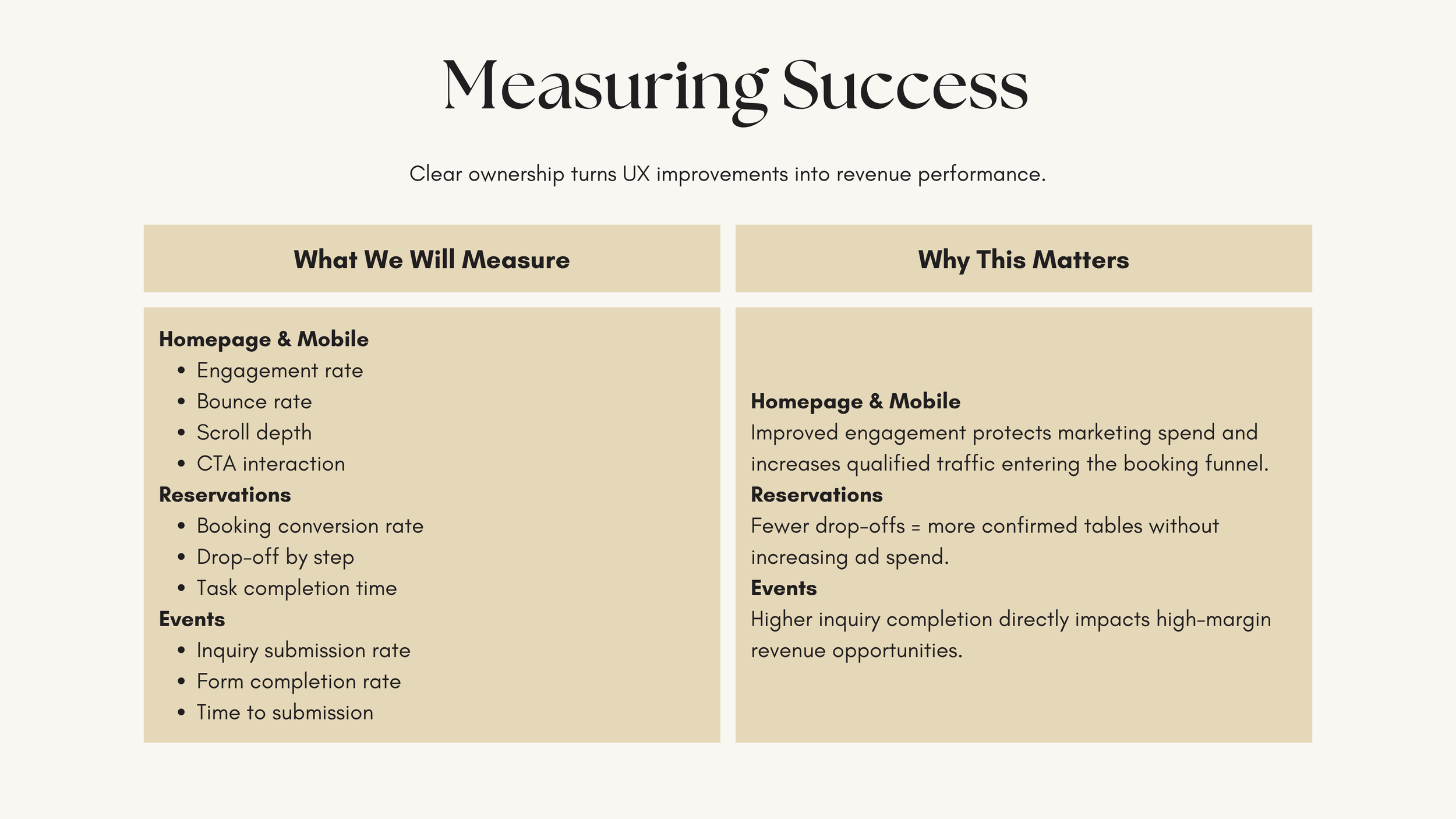
REVENUE IMPACT
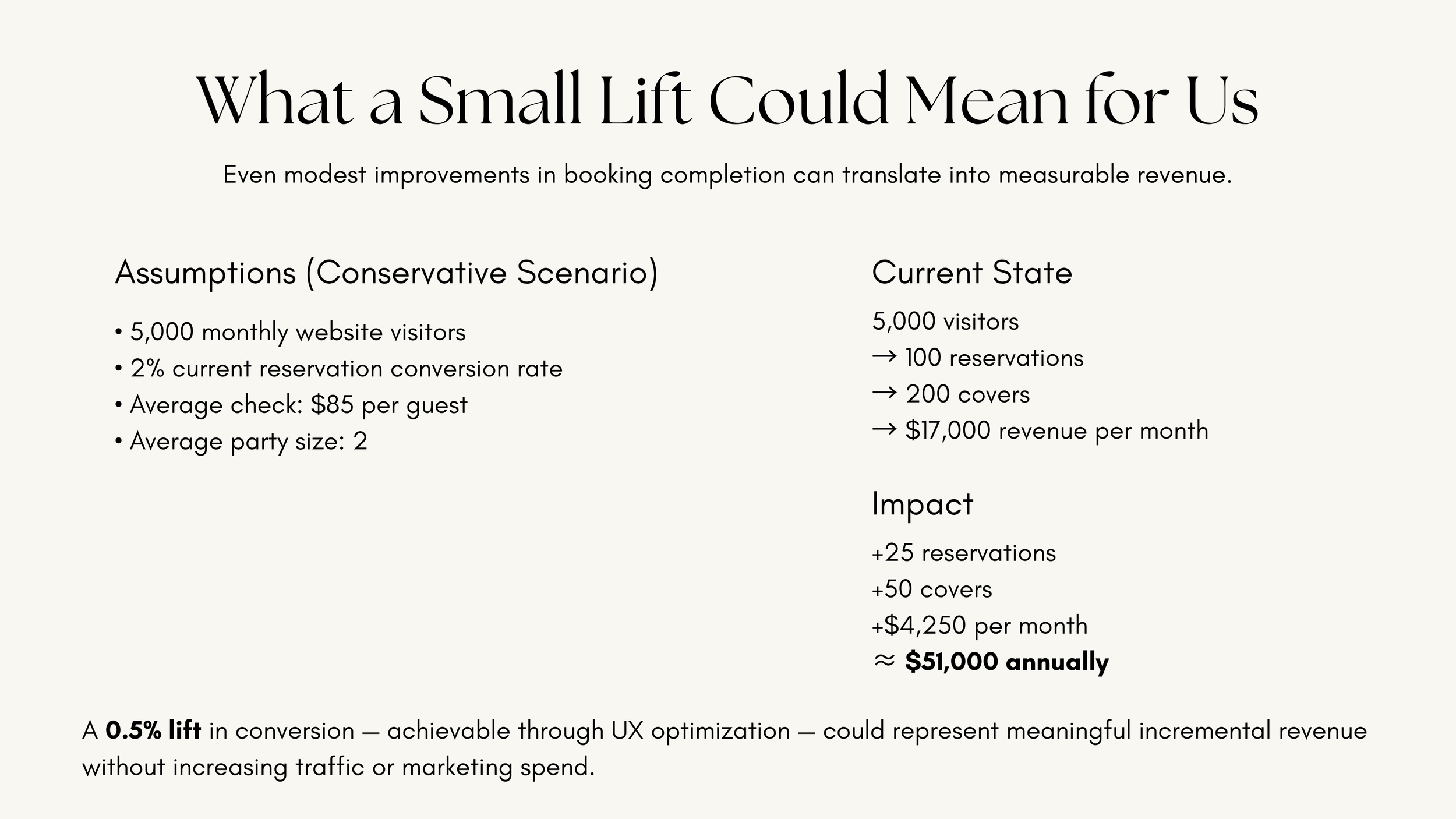
A 0.5% lift in booking conversion, achievable through these UX changes alone, could represent approximately $51,000 in incremental annual revenue. No additional traffic. No additional marketing spend. Just a better path to booking.
STRATEGY
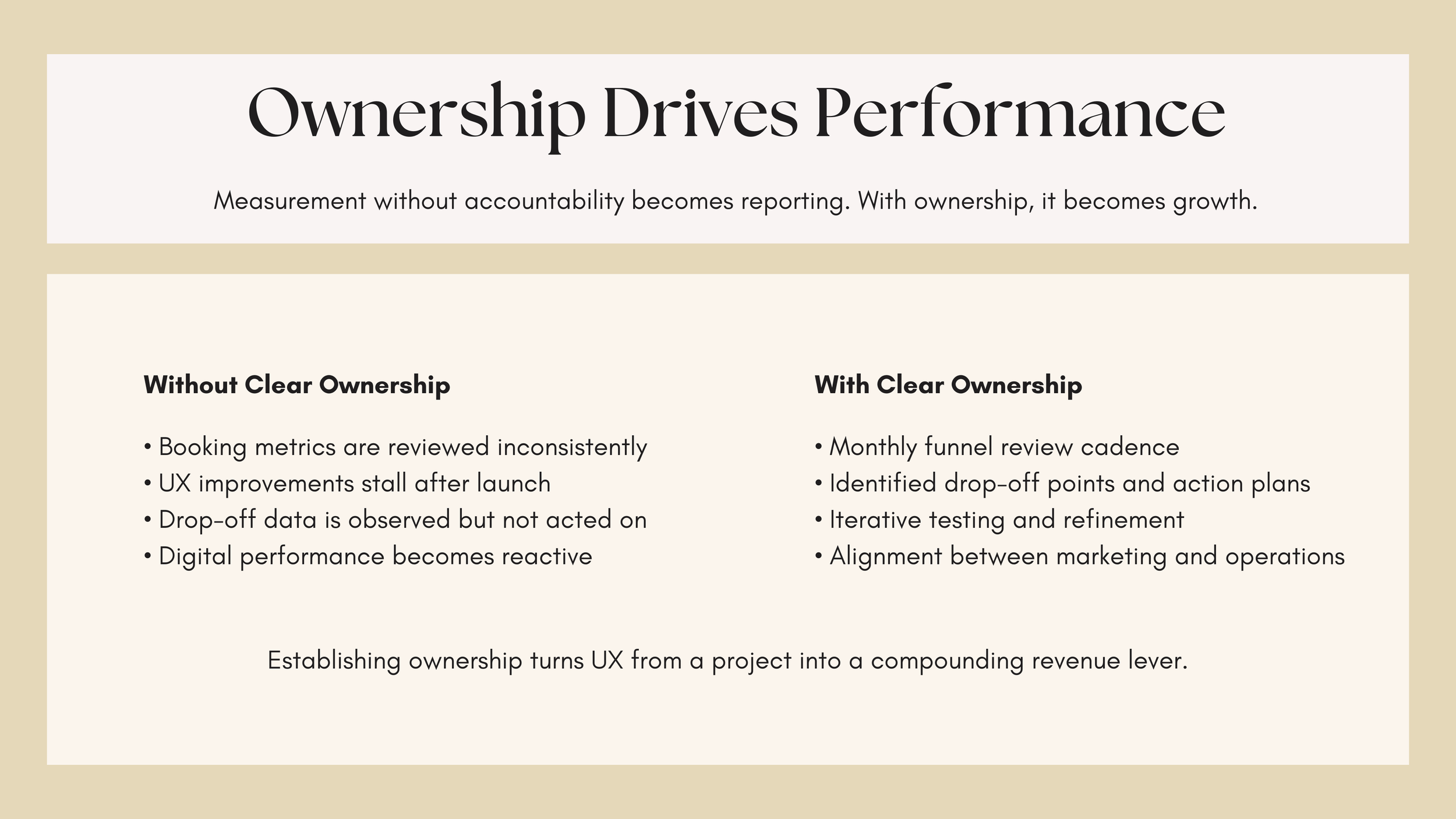
KEY TAKEAWAY
This project sharpened something I already believed: the most valuable design work connects decisions directly to outcomes. Translating "this button is hard to find" into "this could cost you $51K a year" is a different kind of thinking, and it's the kind that gets taken seriously in a room full of operators.
I built this without being asked. That's not unusual for me. If something isn't working, I'd rather bring a solution than wait for someone to notice the problem.