ALOAN
Loan Portal Enhancement Proposal
ALOAN is a loan portal app concept that would allow users to apply for eligibility, borrow, and repay loans. This project was UI focused and began as a concept pitch to convert an existing federal agency webpage into a mobile application. I produced this concept and prototype over the span of 6 weeks.
My Role
My role was to dive into user research, create wireframes, and prototype the digital product. I developed the entire project as a design pitch for a government agency, and it took about six weeks from start to finish.
Background
This agency is dedicated to empowering entrepreneurs by helping them launch, grow, and strengthen their businesses. With years of experience, they’ve provided millions in loans, guarantees, contracts, and counseling services to support business owners. Now, about the loan portal: it serves as a central hub where borrowers can easily access loan details, make payments, and retrieve their statements.
Users
I began by collecting quantitative data to pinpoint the problem precisely. Leveraging my role as a support specialist, I conducted concise surveys to delve into user needs. Through this survey data analysis, it became evident that borrowers were seeking:
The ability to access their loan info using mobile devices: Borrowers needed the ability to access their loan accounts in ways that work with their different lifestyles.
A user-friendly experience: Borrowers needed effortless and intuitive navigation.
Simplified Content: Borrowers needed comprehendible content that was easily accessible, and not overwhelming.
Mobile Device Access
The current loan portal's limited to desktops and laptops, causing major headaches for borrowers. Recognizing this, I proposed a solution: revamping the outdated webpage into a sleek mobile app. Now, borrowers can manage their loans seamlessly on the go, eliminating the hassle.

Onboarding
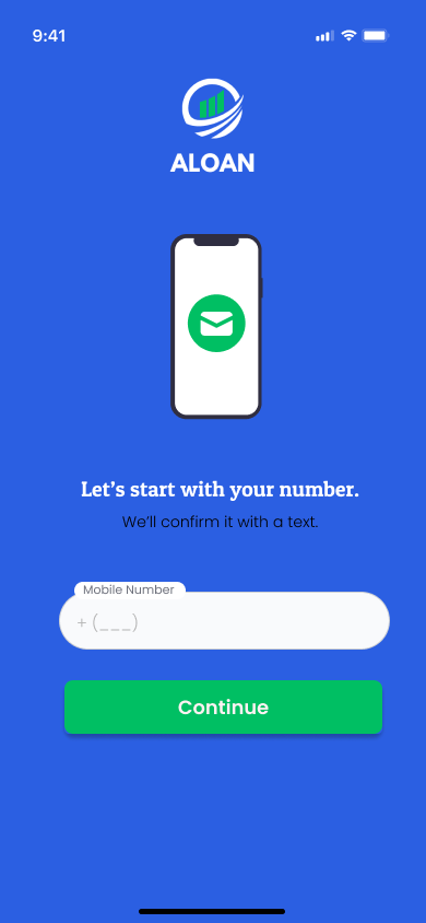
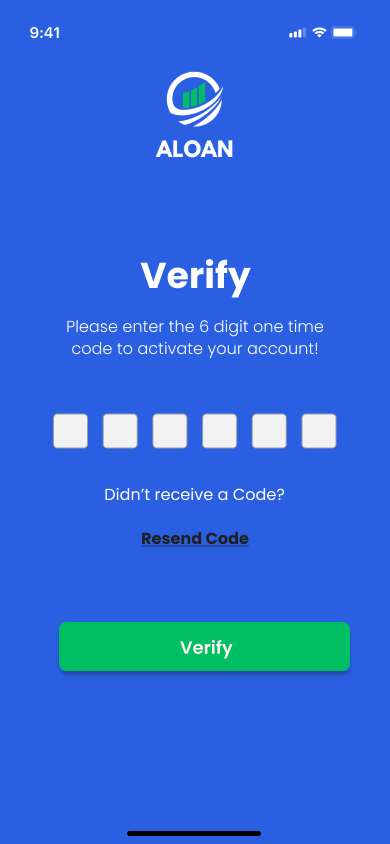
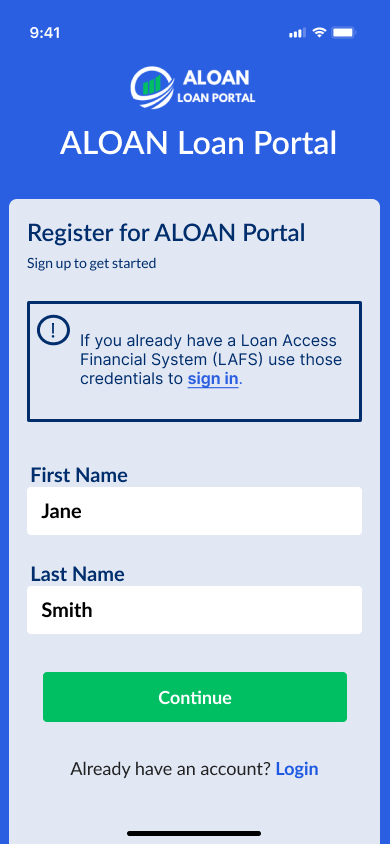
So, when it came to onboarding, my aim was to make it super easy and build confidence right from the start with the app. I get it, business owners have a ton on their plate, so bombarding them with info overload isn't the move. Instead, I split up the info they needed into bite-sized steps. This way, it's all about keeping things simple and giving borrowers that peace of mind. Plus, it lets them nail down their details before jumping to the next step.
Onboarding Obstacles
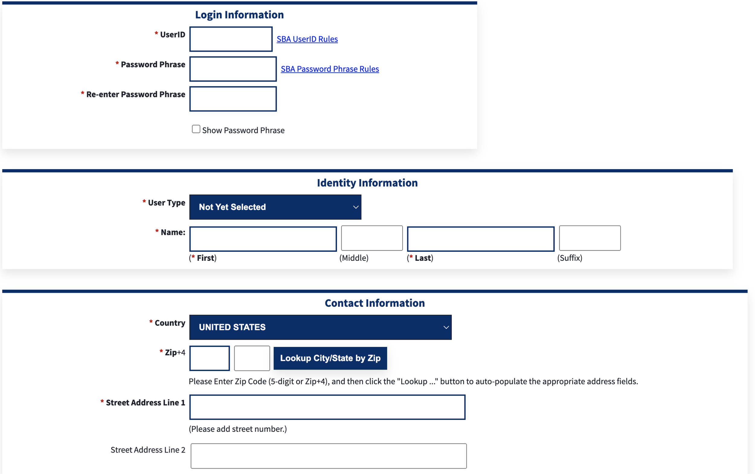
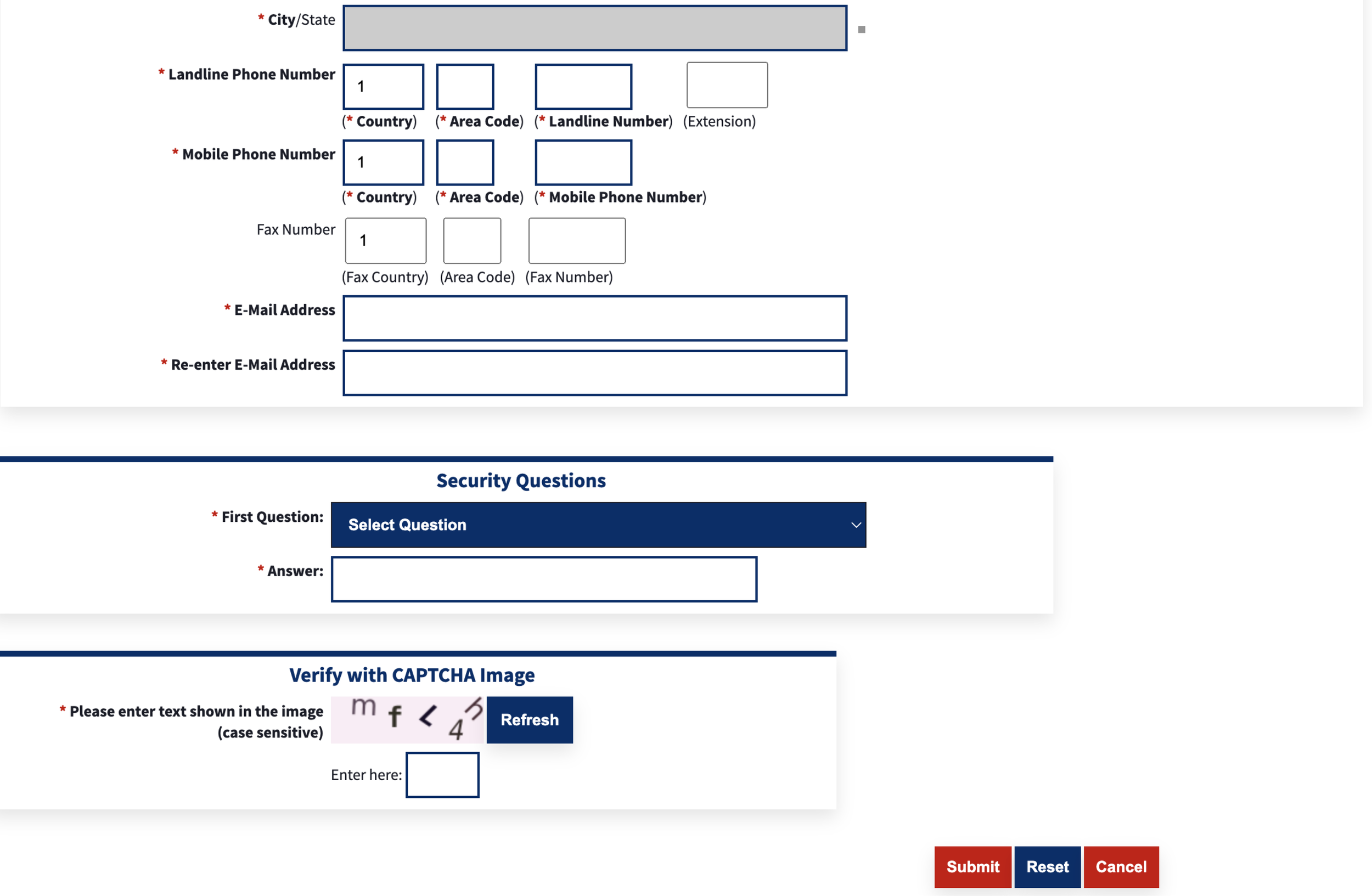
I decided to give the agency's website enrollment process a test run to see if there were any kinks to iron out. It was key to enhancing the user experience. I went through each step with a fine-tooth comb, jotting down any hiccups I hit along the way.
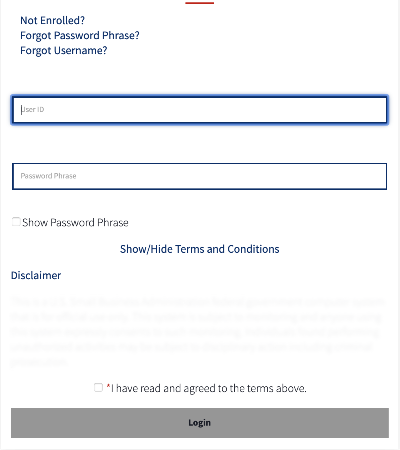
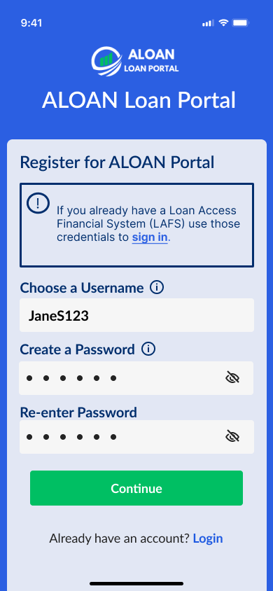
The current portal page seemed to miss the mark on giving clear sign-up instructions and criteria. It left new users scratching their heads during registration. When there's no clear guidance on what info is needed or how to enter it, users can feel lost and annoyed. That kind of experience might even make them bail on signing up altogether. A good onboarding process should lay out step-by-step instructions and clear criteria for filling out fields, making sure users breeze through enrollment.
Proposed Solutions
Smooth Onboarding Process
Drawing from my research and user feedback, I designed a streamlined onboarding experience that helps users get started quickly and confidently. The flow prioritizes simplicity, reduces unnecessary friction, and introduces key features at the right moments to address common pain points. The result is an onboarding experience that feels intuitive and sets users up for success from their very first interaction.

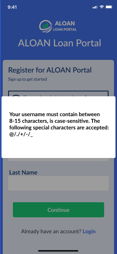
Overlay with detailed username requirements appears after clicking on the info symbol.
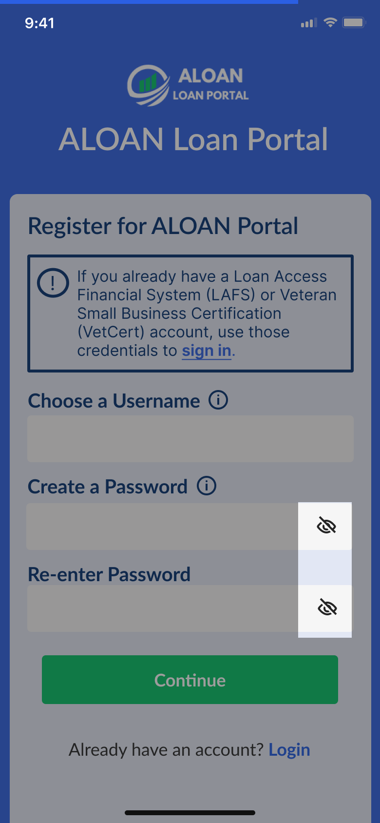
Added visibility icon reveals what is typed in the password fields to assist borrowers with ensuring their passwords are accurate and matching.
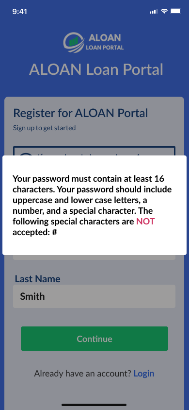
Overlay with detailed password requirements appears after clicking on the info symbol.Designing with Purpose
Knowing that the dashboard is usually the first thing users see when they log in, I made sure to design it with usability and relevance in mind. I dug into data from the loan portal website and listened to what users had to say to figure out the most important metrics and features. The goal was to keep users engaged and make sure the app does what it's meant to do.

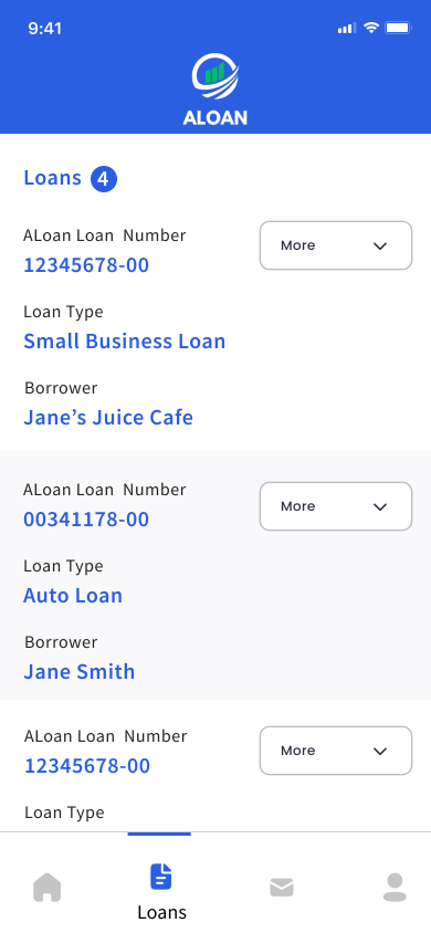
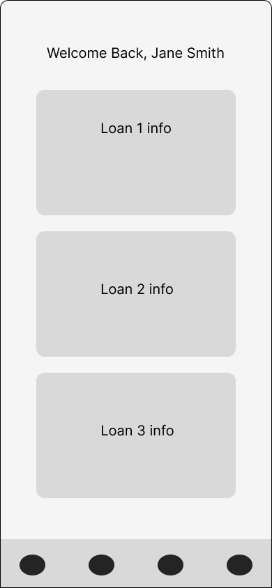
In the initial wireframes, I made sure to pack in all the important info in an easy-to-find way. But as I kept working on it, I tweaked the layout and ended up with a homepage that shows borrower loans right off the bat, all neatly organized into easy-to-read cards with clear action buttons. I also added a resources section to keep users updated on any info that could affect their loans.
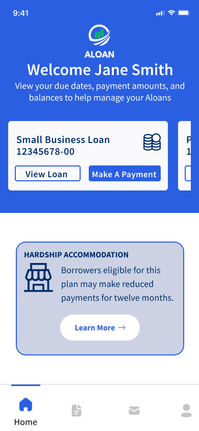
Key Components of the Dashboard Experience
Data Visualization: Leveraging intuitive charts, graphs, and visual elements, the dashboard presents complex information in a digestible format, enabling users to glean insights at a glance.
Real-time Updates: By integrating real-time data feeds and notifications, the dashboard ensures users stay informed about critical updates and changes, fostering a sense of timeliness and relevance.
Actionable Insights: Empowering users to take proactive steps, the dashboard provides actionable insights and recommendations based on data analysis, guiding decision-making and facilitating strategic planning.
Streamlined Loan Management
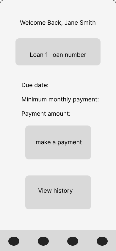
I based the mobile loans page on the existing loan management experience to create a familiar, intuitive interface. Key details like the loan number, loan type, and borrower information are surfaced upfront, while a collapsible section provides quick access to additional loan details without overwhelming the screen. By carrying familiar interaction patterns into a mobile-first experience, users can easily manage and review their loans from anywhere.